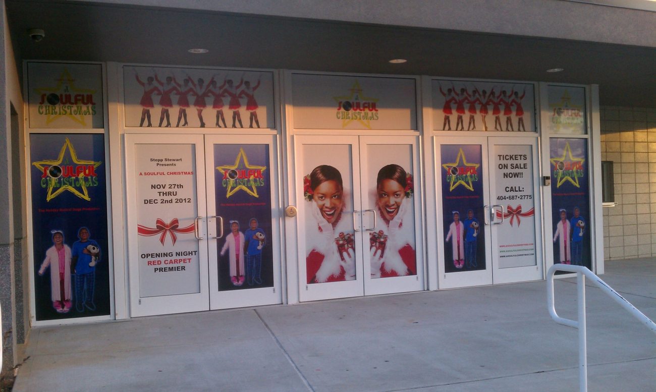
Your storefront is the first thing customers see when they come to your business, and it’s how they decide whether or not to stick around and give you their business. Because of this, it’s essential that you design an attractive storefront that makes potential customers want to spend time in your store. Here are some important things to consider for your storefront presentation that will make people think highly of your business!
Tips to Make Your Storefront Communicate with Consumers

Designing effective signs is critical if you want to make your storefront communicate with consumers. Here are three considerations you should keep in mind when designing your storefront:
- Size – Start with what will work best for your business and potential customers. Consider where you might need more space based on any promotions or seasonal needs, as well as where you will want interactive elements like register points, tables, other signage, etc. Think about how much inventory you’ll have at one time and whether or not you’ll have a drive-thru window.
- Color Scheme – Color plays a huge role in how customers perceive a store’s offerings. Make sure the colors on the outside of your storefront match the colors inside so people know exactly what they’re walking into. For example, using cool blues and greens outside would imply cool drinks are available inside, while warmer oranges and yellows imply hot items such as coffee or donuts.
- Lighting – Make sure there’s enough light inside so shoppers can see all of your goods, but also avoid harsh overhead lighting that makes people feel uncomfortable from above or glare from sunlight coming through windows outside.
Storefront Signage Styles
Make your storefront stand out with a visually pleasing, professional design. Signs and graphics help grab the attention of customers on the street and can elevate the visual quality of your building. The most common styles available for you to use in order to make your store more visible are:


